More Features, Less App: How the Tools You Love Slowly Become the Tools You Dread
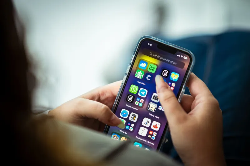
Remember the first time you opened Evernote? It was clean. It was fast. You typed a note, it saved, and you moved on with your life. That was the whole deal — and it was genuinely great. Then came notebooks, then tags, then web clipping, then templates, then a home dashboard, then task management, then a calendar view. Somewhere in that pile of additions, the simple note-taking app became a productivity platform nobody asked for.
Evernote isn't alone. This is a pattern so common in the app world that UX designers have a name for it: feature creep. And it's quietly ruining some of the most useful tools on your phone right now.
The Pressure to Keep Adding Stuff
Here's the thing about building an app people love: success creates a very specific kind of problem. Investors want growth. Growth means new users. New users want new reasons to download. And new reasons to download almost always means new features.
The logic sounds reasonable on paper. If users love your app for doing one thing well, they'll love it even more if it does five things well, right? Not really. What actually happens is that the original experience — the clean, focused version that made people evangelists in the first place — gets buried under layers of functionality that most users never asked for.
UX designers talk about this constantly. The pressure to ship features isn't just internal. Users request things. Competitors launch things. Tech blogs write articles about what an app is missing. Every one of those forces pushes product teams toward the same decision: add more.
The problem is that nobody's job title is "Chief Feature Removal Officer."
When More Becomes Less
There's a psychological concept called cognitive overload — basically, your brain has a limit to how many decisions it can process at once before it shuts down and opts out entirely. App designers know this. And yet the economics of the app market keep pushing products past that threshold anyway.
Think about what happened to Twitter — now X — over the past few years. Spaces, Communities, Subscriptions, long-form posts, video, a rebranded identity, paid verification. The original appeal of Twitter was its simplicity: 140 characters, a timeline, a follow button. You knew exactly what you were getting. Today, opening the app is a negotiation with a dozen different content formats and monetization experiments.
Or consider Slack, which started as a straightforward team messaging tool and has since grown into something that requires onboarding sessions to fully understand. The irony is that Slack was supposed to replace the complexity of corporate email. Now it's got Huddles, Canvases, Workflow Builder, and a home screen that looks like a project management dashboard.
None of these additions are necessarily bad on their own. The problem is cumulative. Each new feature adds friction. Each new menu item is one more thing your brain has to skip past to get to what you actually came for.
The Signs Your Favorite App Has Gone Too Far
So how do you know when an app has crossed the line from genuinely useful to bloated beyond repair? There are a few reliable tells.
You need a tutorial to do the thing you used to do automatically. If an update ships and suddenly your familiar workflow requires three extra taps to find, that's a red flag. Apps should get easier over time, not harder.
The onboarding screen has more steps than a mortgage application. When a new install walks you through eight permission requests, four feature highlights, two upsell prompts, and a "tell us about yourself" survey before you can do anything, the app has forgotten what it's actually for.
The settings menu has settings. This one sounds like a joke, but it's not. When an app's configuration options are complex enough to require their own sub-menus and sub-sub-menus, the product has grown past the point of user-friendliness.
You use maybe 10% of what it offers. This is the quiet one. If you've been using an app for a year and there are entire sections you've never touched, that's not a feature-rich experience — that's an app that's been optimized for its marketing page, not for you.
The Apps That Got It Right by Staying Small
Not every app falls into this trap. Some of the best tools on the market right now are the ones that have actively resisted the urge to expand.
Things 3, the task management app from Cultured Code, is a good example. It does tasks, projects, and scheduling. That's basically it. The developers have been remarkably disciplined about not turning it into a full productivity suite, and the user base loves them for it. Same goes for Fantastical in its earlier iterations, and for apps like Bear, which handles notes with a level of restraint that feels almost radical in today's market.
The irony is that staying focused is actually harder than adding features. It requires saying no constantly — to user requests, to investor pressure, to the competitive instinct to match every move a rival makes. That kind of discipline is rare, which is exactly why it stands out when you find it.
What You Can Actually Do About It
You're not powerless here. There are a few practical ways to manage the bloat problem without just hoping your favorite apps figure it out.
First, give yourself permission to downgrade. Seriously. If an older version of an app worked better for your needs, it's worth asking whether the update actually improved your experience or just added stuff you don't use. Some apps let you stay on older builds — it's not always an option, but it's worth knowing.
Second, explore alternatives before they become mainstream. Smaller, newer apps often have the focus that established ones have lost. The catch is they might not stick around — but that's a different article.
Third, audit what you actually use. Spend five minutes with your most-opened apps and identify which features you rely on versus which ones you scroll past. If the ratio is heavily skewed toward unused features, it might be time to find something leaner.
And finally, pay attention to how an app feels after updates. That slight sense of annoyance or confusion when you open something that used to be effortless? That's not just you being resistant to change. That's your brain correctly identifying that something got worse.
The Bottom Line
Feature bloat isn't a conspiracy. It's the natural result of market pressure, competitive anxiety, and the very human instinct to equate more with better. But for the people actually using these tools — not the investors, not the product managers, not the tech journalists reviewing feature lists — more often just means slower, messier, and harder to love.
The best app is still the one that does its job and gets out of your way. Maybe the question to ask before your next download isn't "what can this do?" — it's "what does this not do, and is that actually a selling point?"