Less Is More, and Your Phone Knows It: The Quiet Rise of Apps That Only Do One Thing
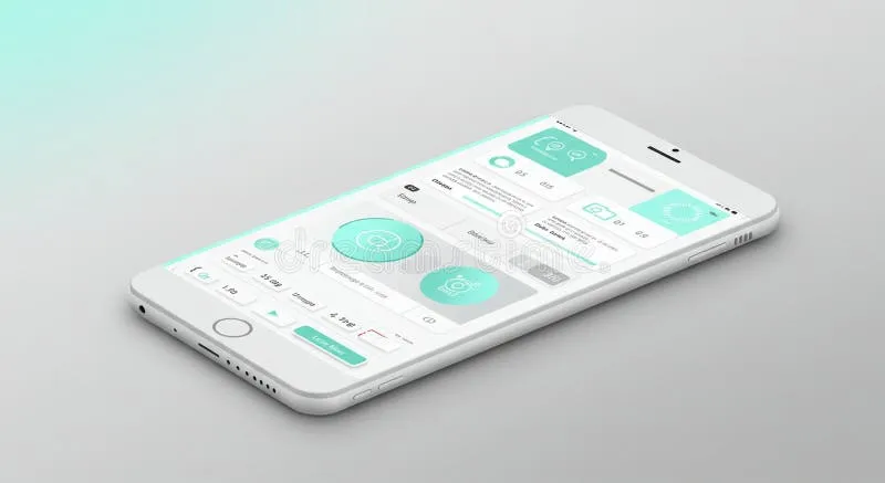
Photo: minimalist smartphone app interface clean design, via thumbs.dreamstime.com
There's a certain kind of app fatigue that sets in after you've spent twenty minutes hunting for a single button buried inside a tool that also wants to manage your calendar, track your mood, generate AI summaries, and remind you to drink water. At some point, you stop using the app altogether — not because you don't need it, but because getting to the part you actually need feels like a part-time job.
That frustration is quietly fueling one of the more interesting shifts in the app world right now. Minimalist, single-purpose apps are having a genuine moment, and it's not just a design trend. It's a response.
How We Got Here
For most of the last decade, the dominant logic in app development was additive. More features meant more value. More value meant better reviews. Better reviews meant more downloads. The formula made sense on paper, and it drove every major platform — note-taking apps, task managers, photo editors, you name it — to pile on capabilities until the original purpose of the app felt like an afterthought.
Notion is probably the most famous example of this. It started as a note-taking tool and grew into something that can, theoretically, run your entire company. For power users, that's a dream. For the person who just wants to jot down a grocery list, it's a nightmare of databases, templates, and onboarding flows that never quite ends.
The irony is that the more an app tries to do, the harder it becomes to do any of it well.
The Indie Developer Perspective
Talk to indie app developers — the ones building and shipping solo or in tiny teams — and you'll hear a consistent theme: constraints aren't a limitation, they're a feature.
Marco Arment, the developer behind Overcast (a podcast app that does podcasts and nothing else), has talked publicly about how deliberately keeping scope small allows him to obsess over the parts that actually matter to listeners. The result is an app with a loyal, paying user base that keeps coming back not because it does everything, but because it does one thing better than anyone else.
Smaller developers across the App Store are following a similar philosophy. Apps like Bear (writing), Reeder (RSS), and Halide (camera) have all built strong reputations by committing hard to a single use case and refusing to drift. Their users aren't just satisfied — they're evangelical.
"When you limit what the app can do, you force yourself to ask what it should do," one indie developer told us. "That question changes everything about how you build."
What Users Are Actually Saying
Spend any time on Reddit's r/productivity or r/apple communities and you'll find threads full of people actively seeking out minimal alternatives to the apps they've outgrown. The asks are remarkably consistent: something fast, something focused, something that doesn't require a tutorial.
Users who've made the switch describe a kind of relief. Less cognitive overhead. Faster load times. No feature they didn't ask for competing for their attention. One user summed it up bluntly: "I switched from Todoist to a $3 app that just shows me a list. My productivity went up immediately because I stopped tweaking settings and started doing things."
That sentiment — stop tweaking, start doing — might be the clearest articulation of why minimalism resonates right now. We're all a little exhausted by software that demands our attention even when we're trying to use it to get things done.
Big Tech Is Starting to Notice
Here's where it gets interesting. The same companies that spent years building increasingly complex platforms are quietly rolling back. Apple's own apps have trended cleaner and more focused in recent iOS releases. Google stripped down several of its productivity tools after user research showed that most people were using a fraction of available features. Even Microsoft has introduced a "simplified ribbon" in Office after years of feedback that the interface had become overwhelming.
None of these companies would frame it as admitting a mistake. But the direction is unmistakable. Complexity has a ceiling, and a lot of mainstream apps hit it a while ago.
The Design Argument
From a pure UX standpoint, the case for minimalism has always been strong. Fewer choices reduce decision fatigue. Cleaner interfaces lower the learning curve. Apps that load fast and get out of the way create better habits around actual usage.
There's also something to be said for the confidence that single-purpose design signals to users. When an app commits fully to one thing, it communicates that the developers really thought about that thing. Every interaction feels intentional rather than incidental.
Compare that to the experience of opening an app and immediately feeling like you've walked into the wrong room. That disorientation has a cost — usually measured in the number of seconds before you close the app and never open it again.
So Should You Go Minimal?
Not necessarily across the board. All-in-one tools still make sense in plenty of contexts, especially when you genuinely need different functions to talk to each other. If your work requires a project management tool that integrates tasks, docs, and communication, a minimal app probably isn't going to cut it.
But for personal use — the apps you reach for throughout your day — it's worth asking whether you're actually using everything a given app offers, or whether you're just living inside its complexity because switching feels like too much work.
The good news is that the App Store has never had more high-quality minimal options across almost every category. Writers, note-takers, list-makers, readers, and photographers all have compelling focused alternatives available, often at a one-time price that's lower than a single month of a premium subscription to the bloated version.
Maybe the best app isn't the one that can do anything. Maybe it's the one that makes it impossible to do the wrong thing.